Introducing the Analytics page: a dedicated home for sentiment and visibility trends

Today we're introducing Analytics — a dedicated page that rolls every Experiment a brand has run into a single, scannable view. Instead of clicking through individual executions to assemble the picture, you open Analytics and the picture is already there.
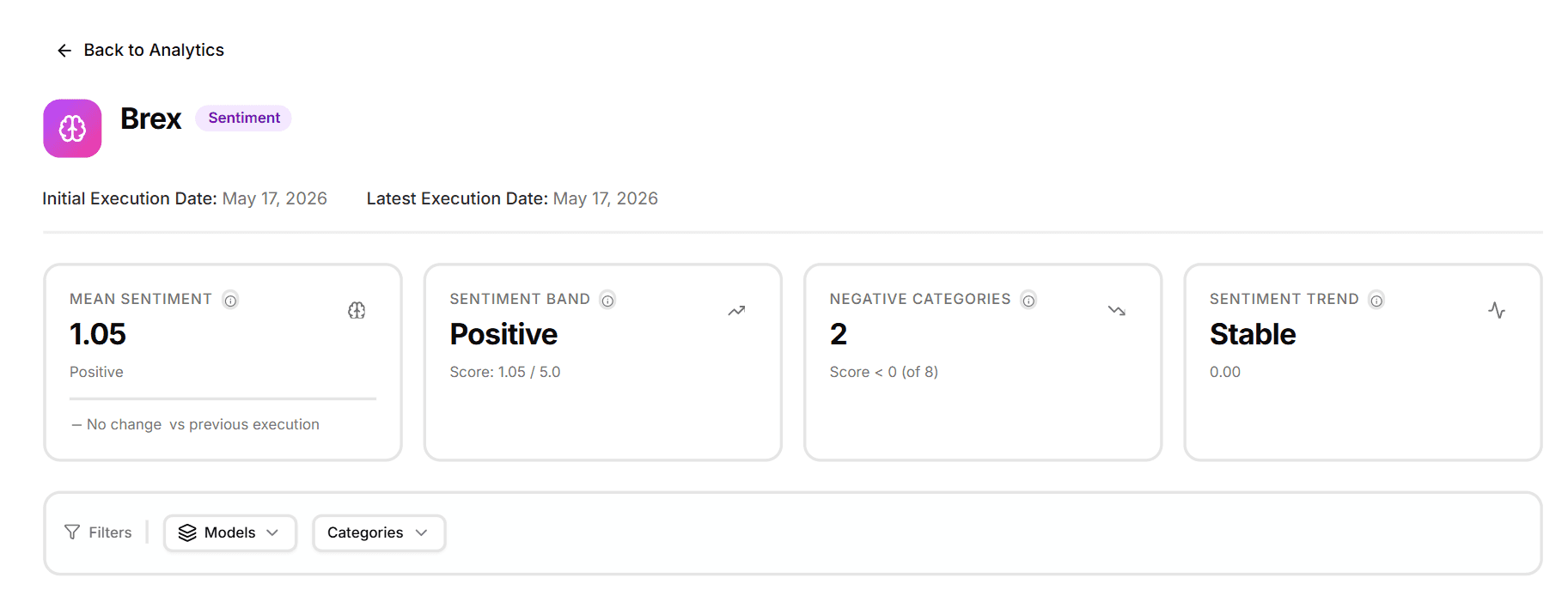
Four KPIs at the top
The page leads with four headline cards designed to answer the questions you actually have at a glance:
Mean Sentiment — the average sentiment score across every result in scope, with a label (Positive / Neutral / Negative) and a delta vs. the previous execution so you can see whether the number is moving.
Sentiment Band — the headline band the mean falls into (Positive, Neutral, Negative), plus the raw 5-point score for context.
Negative Categories — a count of categories with a sentiment score below 0, on the total number of categories tracked. Tells you how many problem areas you have without scrolling.
Sentiment Trend — the trend direction across executions: Stable, Rising, Falling. Calculated from your run history so you don't have to eyeball a chart.
Hover any card and you get a one-line tooltip explaining what the number means and how it's calculated. Click a card and you drop into the underlying data.
Why a dedicated page
The Overview tab inside an Experiment tells you about one execution. The Analytics page tells you about the brand, across every experiment and execution you've run. It's the view you bring to a weekly review, a board update, or a "how's our AI visibility doing?" question — without having to assemble it from individual run pages.
Available today
Find it in your sidebar under Reporting → Analytics. Sentiment is the first surface live; Visibility lands on the same page in the same shape. The Insights Agent reads the same data if you'd rather ask questions in chat instead of reading the cards.
